Somewhere in a fancy hotel ballroom, a distinguished speaker takes the stage. The crowd is hushed. This session is the reason they came to the conference. The speaker confidently scans the audience. Ready to deliver a slam-dunk keynote. The audience collectively leans forward in their seats as the speaker begins.
“Good morning. This presentation is not for you and, frankly, I don’t care about your experience.”
Shocking, right? Rude, even. Who would start this way? What if I told you, that your presentation materials may be sending this very message to people in your audience? When we fail to address accessibility for speeches, presentations, workshops and meetings, we are disinviting people from the experience.
I recently had the opportunity to interview James Warnken, a Digital Accessibility Consultant at Blind Institute of Technology (BIT), whose mission is to help professionals with disabilities, and the employers who hire them find success in the workplace. At BIT, James teaches a 14-week class which prepares these professionals to pass the Certified Professional in Accessibility Core Competencies exam.
Talking to James was a privilege. His passion and depth of knowledge was apparent immediately. Our conversation was a great reminder that now is always the time to improve the accessibility of our presentations.

Kirsten
What are some of the most common mistakes that you’ve observed in presentations when it comes to accessibility?
James
The biggest thing that comes across in in-person [presentations] is that the organizers don’t always know their audience. They don’t know who’s coming into the room, so they find it very challenging to account for the different types of abilities or people that are coming into the room.
You might have people in the room that don’t disclose that they have a disability or that they have a hard time seeing or a hard time hearing, and so you ultimately end up with your users having a little bit of a sour taste in their mouth because the event wasn’t designed from a “universal lens.” [For example,] the speaker asks if everyone can hear them and if they get a couple of “yesses”, they don’t use the microphone.
[You] might be creating a barrier that you’re never going to know about [for] somebody who has a hard time hearing or somebody that’s sitting in the back, that doesn’t even have a disability. The same thing goes from a visual standpoint. If you’re referencing things on the slide and using language like, “as we can see by this slide” or” looking at this chart,” or whatever those visual cues or indicators might be.
It’s disengaging when there’s a visual component, and I don’t know what’s going on and have no context to it. To me, that’s when I start to daydream.
There’s a lot of nuance to it, but it ultimately comes down to knowing your audience. And I’ll say that for [virtual presentations], again, it’s knowing your audience, but being prepared and being equipped to accommodate people sort of on the fly at the ready and just thinking about those different user abilities before the event even happens.
 One of the things I do is make my slide decks available before the event so that somebody with, say, a screen reader or somebody with low vision can get access. If there are things that are being referenced or pointed out, then the user most likely has already familiarized themselves with it. If not, I make them available immediately after and one thing that I always do is include multiple different formats.
I’m always including a PowerPoint and a PDF or a PowerPoint and a Google Slides version because chances are with assistive technology, one it’s going to work better than the other.
Kirsten
What are the considerations you should make about your platform?
James
[Whether it is] Zoom, Google Meets, or Microsoft Teams, does IT support live captions or not? Does IT support minimizing distractions on the screen for somebody with cognitive disabilities? Since there’s 30 people in there and they can see 30 tiles, but there’s only one person talking and presenting. That might be a big cognitive load for somebody with trouble paying attention or focusing or becoming easily distracted. Try to maximize the accessibility for everyone that is coming into that room.
Not to make this sound overwhelming, because once you actually get into it, it’s really not that difficult or complex. It’s just a different way of thinking than most of us have been trained or that we’ve learned how to do things we have.
Kirsten
Right, it can feel a bit scary when you first do an accessibility check and you have a lot of errors, you’re like, “Oh my gosh. How am I gonna fix all this?” But you’re saying once you start to understand it better, and you start practicing it, you can learn the skills fairly easily and put them into practice?
James
Yeah, it will just become the default, right? You’re just creating a new default version of how you present or how you design a slide deck. [Beginning] can be as simple as right clicking on an image and adding alt text or changing the color. Very minor, subtle things like that can make a huge difference in the presentation and keeping people active and engaged.
Kirsten
Those are excellent examples. When audience members may be using screen readers, how do you handle imagery?
James
I try to minimize the content of my slides and keep them very visual to keep the visual user engaged. A lot of people are very visually driven so I [use] images or icons or things like that off to the right, text to the left, but to answer your question about the screen reader, if you’re marking things appropriately as decorative, a screen reader is going to completely skip over it like it’s not there.
So it just goes back to that intentionality. Is this something that the user needs to know about? If the answer is “no,” mark it as decorative. If it adds value to the conversation or to the presentation, then let’s give it a proper description. Typically, we want to keep those descriptions to a sentence or two. We don’t want to write a novel.
From your perspective as the author, what value is this adding? [For example], if [I’m] giving a presentation, talking about choosing accessible colors, and I put the color wheel there as my visual, I would want to put some kind of description there that says, “When it comes to choosing colors, there’s a lot of options out there. But only certain combinations are effective when it comes to different user visual acuities,” or something like that. That doesn’t just say this is a color wheel, or this is a cup of coffee, or this is a dog with his tongue hanging out because he’s hot. We don’t want to necessarily be 100% literal all the time.
We want to approach it with that same creative approach that we are the rest of the presentation.
Kirsten
When a presenter forwards to a slide with images with alt descriptions, should they take a beat for the screen reader to read the information, so the presenter isn’t talking over it?
James
You don’t need to change your presentation style. I would just create small check-ins, or small pauses essentially taking the temperature of the room as the presenter. Look around. If somebody’s looking down at their phone or they’re messing around with their keyboard or something like that, chances are they’re probably taking notes, or they’re trying to advance the slides. So maybe give them a second or two – take a drink of water. You can brush it off in a very nonchalant way to where it doesn’t seem like you’re waiting on the audience.
Kirsten
I love that, because a presenter should always be paying attention to their audience. Checking in and pausing to make sure they are with you.
James
And that all comes down to fine tuning your presentation style. You can do it with comedic relief. You can walk to the other side of the stage if you’re in person. You could ask if there’s any questions. There’s a lot of different ways you can integrate pauses without disrupting the content in a way that will allow users with assistive technology to catch up if they need to.
When I’m teaching a class, trying to keep attention for two hours straight is difficult. I try to chunk my content out, and after 15 to 20 minutes, I’ll throw a story in there or I’ll throw a Q&A break. I’ll do something to give [the audience] relax, refocus, reengage. That way they can easily and more effectively retain the information.
Kirsten
That’s the whole ball game! Those are tools that ought to be put into place in every presentation. How do you know when more specialized accessibility tools should be implemented?
James
If your audience is filling out a registration form, one of the things I always encourage event coordinators or organizers to do is just include [questions] in the event registration like, “Do you have any special requests [or] an accommodation? Would you prefer sign language interpretations? Should we ask everyone to keep their mics muted during the meetings?”
Kirsten
Is it better to include specific examples or ask about accommodations in general?
James
Anytime you can, include examples, [and remember] not all disabilities can be treated the same, because there’s more to a person than their disability, right? There’s personal preferences, there’s customization, everything can be tailored to the individual now. I can turn my phone in dark mode and all of my apps update. I can do all of these different things to customize my experience. Assuming that this is only going to benefit people with disabilities is the wrong way to think about it.
Accommodations don’t only benefit people with disabilities, and I think that is a huge component that more and more organizations need to start to take account of. We’re not doing this specifically for people with disabilities. We’re doing this to create and foster a better and more inclusive experience for everyone based off of their personal preferences, accompanied with their accommodation request or their assistive technology.
Kirsten
In our Platinum Rules of Presentations class, we advise presenters not to read the slides out loud because from what we have read and researched, reading the slides is a pet peeve and even inhibits learning. However, is that outdated in terms of accessibility? And is it different for in-person versus virtual presentations? If somebody puts a big quote up? I usually put a quote up and then I’ll say, “everyone take a moment to read this for yourselves.” What’s your recommendation about that?
James
I’ve gotten mixed feedback on this. Personally, I don’t read off of my own slide decks. Primarily because I can’t see them. For me to be fully on camera in a digital setting, I have to be too far to be able to see what’s on my screen, and even more so in person – I can’t see what’s on the screen. I lean towards the slides being complementary. Not being a replacement.
This is just my presentation style. I want people to focus on me and what I have to say more than I want them reading off of a script, because if everything can be read off of the screen, what’s the need for me as the presenter? Why didn’t I just send them a Microsoft Word?
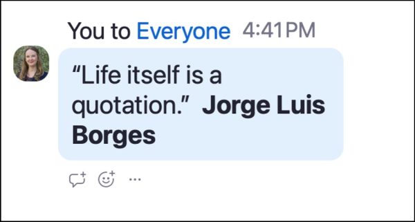 In the case of something like a quote, if you’re sending the slides in advance, don’t read word for word off of your slides because they’ve already read it. They’re familiar with it. They’re now here to hear the in-between, to answer the questions they had about what they read. If you can’t [send the slides in advance], one of the things you could do in a [virtual presentation] is if you put a quote on the slide – one of the features that is usually pretty accessible is the chat feature. You could have that quote or that text geared up to copy and paste into the chat without directly coming out and saying we’re putting this in the chat for people who can’t see it to be able to read it with your screen reader. You could say, “I’m also going to drop this quote in the chat for anybody who wants to save it.”
Kirsten
I’ve had people request the quote in the chat many times. That sounds like a great practice as an accessibility tool and also just to support everyone’s learning.
James
It’s one of the things I’ve learned over the last four years with all of my research and experimenting within the accessibility space: A lot of people the gap between user experience and accessibility is quite large. I think the space between them is quite grey. Accessibility becomes user experience, and a lot of user experience is accessibility.
I learned so much from this conversation with James. If you’d like to learn more, James recommends studying the Web Content Accessibility Guidelines (WCAG) 2.2 guidelines (not just for websites!), taking advantage of the accessibility tools and guides within most slideware programs, following Section508.gov best practices, signing up for the BIT newsletter, and connecting with him on LinkedIn, Instagram or his website.
Thanks to Blind Institute of Technology, James Warnken, and Amy McCaw.
Do you have advice or questions about The Goodman Center’s accessibility practices?
Please share them with us! Email Kirsten at kirsten@thegoodmancenter.com.
Special thanks to Amy Holloway from the Centers for Medicare & Medicaid Services, who took the time to reach out and talk with me about accessibility best practices. She shared some great resources, inspired us to interview James, learn more, and up our game in general. What a gift!
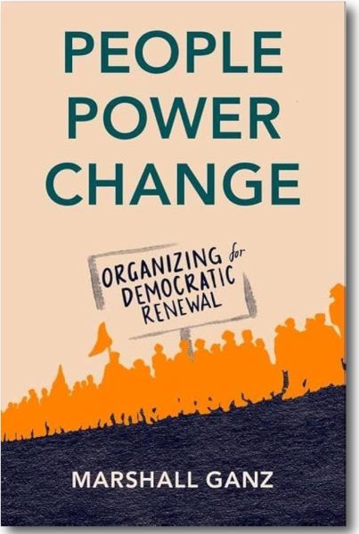 Public interest communications is the work of transformation. Creating a safe, just, and equitable world requires us to transform apathy into caring, caring into action, and action into deep lasting change. Marshall Ganz’s new book, People Power Change: Organizing for Democratic Renewal, provides a framework to build your craft of connecting hearts (caring), heads (strategy) and hands (action). The lessons within are both practical and inspiring: a winning combination.
 But let’s be honest: you’re busy, and even if you do have a webinar to run sometime soon, who needs to expend all that extra energy trying to raise the bar? Running a webinar that’s just as mind numbing as all the others is easy. Just follow these five simple steps:
 identify an existing concern closely related to your issue, you can tap into those feelings through the theme (or frame) of your campaign.
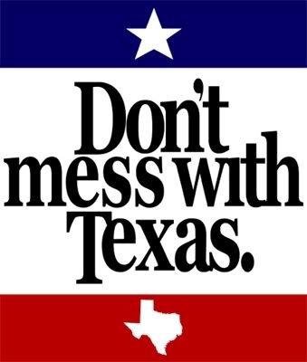 Returning to our Texas example: TexDOT took the proper first step by identifying “state pride” as a core concern, but the campaign would probably have flopped had the slogan been, “Take pride in Texas – don’t litter!” Thanks to the creativity of TexDOT’s ad agency, however, the slogan “Don’t mess with Texas” cleverly translated the theme into words the audience could hear and even embrace.
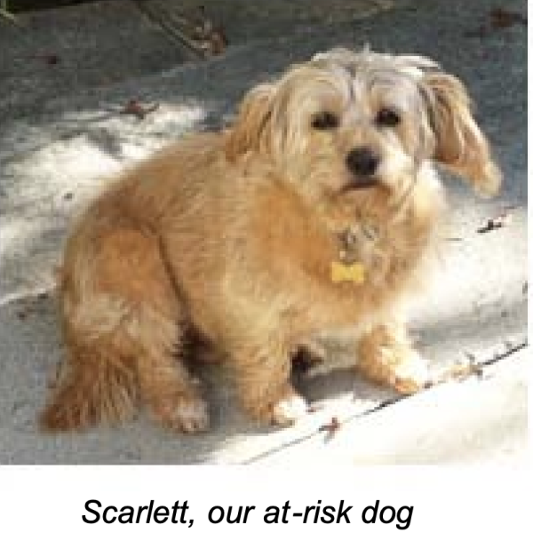
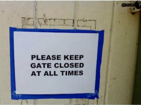
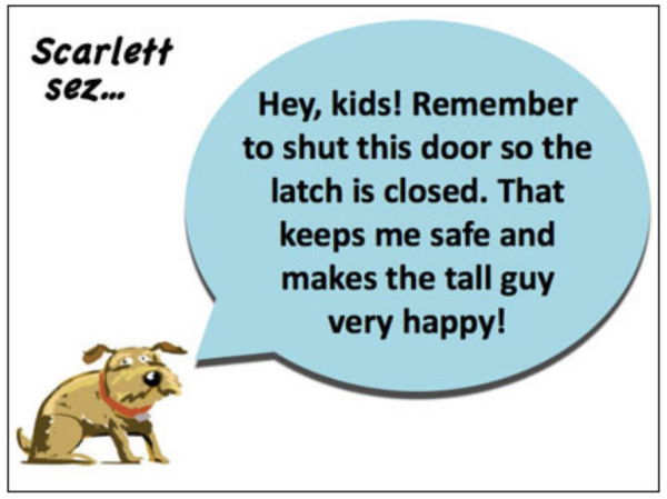 My campaign had an equally straightforward ask – close and latch the gate – but it was delivered in a humorless manner with no connection to the four-legged beneficiary of the extra effort. So I thought it might be more effective to have the ask come from Scarlett herself.


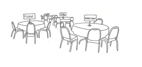 On entering, attendees were asked to sit at the table where, based on their foundation’s location, that particular kind of natural disaster could affect them.


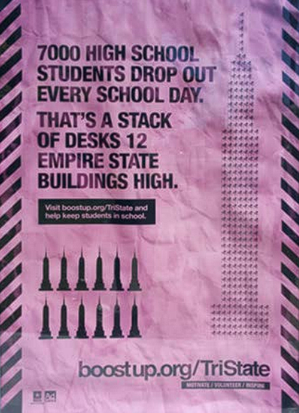 Consider this example from the Ad Council’s BoostUp campaign, which is using social math to contextualize the 7,000 students dropping out of high schools in the United States every day. The ad asks us to imagine a stack of desks as high as 12 Empire State Buildings, something that may be more difficult to picture than simply envisioning 7,000 students. In part, the problem is the mixing of measurement units: we are left trying to compute population into terms of physical space. If readers walk away from this ad thinking about the logistics of stacking desks on top of one another more than the magnitude of the dropout rate, an opportunity is lost.
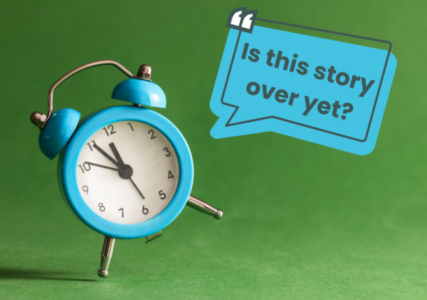 A. Let me state definitively and without fear of contradiction: it depends. If you’re a great storyteller, you can take several minutes. If you’re boring, even thirty seconds will feel too long. That said, consider what happens when someone says, “Hey, I’ve got a story for you.” You’re all ears, right? But whether you’re aware of it or not, a little clock starts in the back of your head, and somewhere around two or three minutes the alarm goes off and that story had better be over. I’m not sure why – maybe that’s because most stories on the news are a couple of minutes long, or that’s how long commercial breaks are on TV – but whatever the reason, most listeners will usually give you 2-3 minutes. (For more on this subject, check out “The Ideal Length of Everything Online, From Tweets to YouTube Videos,” Adweek, 10/24/14. Two stats of particular note: the average length of the top fifty YouTube Videos that year was 2 minutes and 54 seconds; the average length for blog posts was 1,600 words.)