ICYMI: Five Myths About Branding

An organization’s brand has the power to be a memorable point of connection, or an after-thought. As integral as an organization’s brand is, it’s a tricky element to achieve effectively, and prone to easy missteps. In this month’s “In Case You Missed It” from 2002, Andy Goodman poses seven questions to ask yourself before building your brand’s story. 

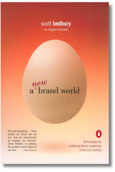
Scott Bedbury knows something about branding. He ran brand-building campaigns for Nike and Starbucks and wrote, A New Brand World, a highly acclaimed book on the subject. “In an age of accelerating product proliferation, enormous customer choice, and growing clutter and clamor in the marketplace,” Bedbury says, “a great brand is a necessity, not a luxury.”

That’s conventional wisdom in the commercial sector, but many public interest organizations continue to wrestle with “the B-word.” In talking to nonprofits and foundations of all sizes and in all regions, I’ve come to the conclusion that five myths underlie this problem:

Myth #1: Branding is for Procter & Gamble, not us.
Face it: Bedbury’s statement holds equally true for public interest groups. Nonprofits and foundations have proliferated rapidly, too, and your audience is probably just as overwhelmed with the number of groups working on your issue. Increasing media clutter affects your message just as much as commercial ones. Branding is a necessity because, at its essence, it’s about establishing a genuine relationship with the audience, and what kind of organization doesn’t need that?

Myth #2: We define our brand. 
You’re half-right. Consciously or not, every organization sends messages about itself to its target audience. In ads, newsletters, annual reports, or just door-to-door canvassing, you may be telling your audience you’re a leader, you get results, you’re competent, you care. But that’s not your brand! There’s another half to this equation: the audience’s experience. Your brand lives in their heads. A strong brand is a strong relationship, which generally implies respect, trust, and some degree of affection.

“Anyone who wants to build a great brand first has to understand who they are,” says Bedbury. “You don’t do this by getting a bunch of executive schmucks in a room so they can reach some consensus on what they think the brand means. The real starting point is to go out to consumers and find out what they like or dislike about the brand and what they associate as the very core of the brand concept.”

Myth #3: We’ve got an identity system. We’re covered.
R. Christine Hershey has worked on such international brands as Disney, Coca-Cola, and AT&T, and through her nonprofit design firm, Cause Communications, she has strengthened the identities of The James Irvine Foundation, Los Angeles Urban Funders, and Liberty Hill Foundation. When it comes to designing logos, picking company colors, or selecting just the right paper stock, Chris is an award-winner, but she’ll be the first to tell you that branding doesn’t end there.

“Branding is your organizational DNA,” says Hershey. “It is everything that represents you to the world. It’s how you get the phone, how your office looks, how you look, your website – it’s not just your printed stuff.”

In Chris’ office, providing personal client service is such an intrinsic value that she ruled out a voicemail system. “Our clients demand a high level of accountability. They want a live person,” she says, so when they call, they get one – every time.

Myth #4: We’re a foundation. The audience is competing for our attention!
Granted, when you’re handing out money, people will always beat a path to your door. But consider the experience of The California Wellness Foundation (TCWF), which disburses up to $40 million a year to groups that improve the health of Californians. In 1996, TCWF surveyed grantees past and present to ensure that the foundation was properly serving its audience. The feedback was mostly positive, but when asked to evaluate the foundation’s communication materials, some of the respondents described them as “intimidating,” “hard to understand,” and “slick in an HMO way.”

With the help of Cause Communications, TCWF gave itself a makeover that affected all aspects of its visual identity (color, typeface, style of photography, paper stock) and every communications tool (website, newsletter, annual report, stationery, signage). The intent was to “warm up” the foundation’s image and make it more accessible to worthy applicants – i.e., community groups that might otherwise have shied away from what they perceived to be a huge, impersonal institution. And it worked: according to VP of Communications Magdalena Beltrán-del Olmo, more grant applications are coming in, and a higher percentage conform to foundation guidelines, indicating clearer communication with the target audience.

 Myth #5: We’re a small nonprofit. We can’t afford it.

Presenting a consistent image to your constituents does not have to be a costly affair. Chris Hershey tells do-it-yourselfers who want to reevaluate their organization’s look to take a piece of paper and divide it into four columns:

  • In column one, list what your organization does – the services you provide, issues you cover, audiences you serve, etc. No judgments or adjectives here – this column is simply for the facts about your work.
  • In column two, list words that describe how your organization approaches these issues and serves its audiences. Are you new and confrontational, established and collaborative, multidisciplinary or single-issue focused? Find the adjectives that your audience would be most likely to use to describe you and list them here.
  • In column three, translate these adjectives into colors, textures, typefaces, and photographic styles. At this stage, it may be useful to have samples to look at (design books or even magazines can help) so you can point to particular shades, fonts, or photos that feel like your organization.
  • In column four, list all your communication tools, from simple door-hangers to television PSAs. Now consider how your list in column three can guide the design of each tool so that all communications materials consistently reflect your image.

A former professor at the University of Wisconsin School of Business, Michael Rothschild now serves as associate editor for Social Marketing Quarterly. “As social marketers, I feel that we have not been concerned enough with developing brands or bonds,” says Rothschild. “We have been more concerned with telling people how to behave and less concerned with building relationships.” Perhaps if we all tried thinking of branding as relationship building, our entire sector will stop being held back by myths.

For more tips on connecting to your audience through brand, voice, and communication, sign up for The Goodman Center’s workshop Strategic Communications: Cutting Through the Clutter on March 31 and April 2. 

The Case for Jargon (Seriously)

Kirsten and a power saw

I love power tools: table saws, electric drills, sanders, and nail guns. The right tool and the skill to wield it, helps me turn my vision into reality. So, what about all the communications “tools” promised to me in my email inbox? 

Tools to help you reach more people, “The 5 five tools you need to hone your message”, or “This new tool is perfect for your next project.” 

Any legit DIY-er knows that it isn’t about owning every tool (who has the storage?) – it is about using the right tool for the right job. 

There is a tool in your communications toolbox that you are probably using wrong, and it is doing more harm than good. 

That tool is jargon. Those of you who have been a part of The Goodman Center community for a long time, might be surprised to hear me even call it a tool instead of imploring you to STOP USING JARGON, like Kentucky Governor Andy Beshear asked democrats to do recently on the Daily Show. 

Beshear makes some great points, but I think Jon Stewart has a better take. “It’s about connecting.” When we are speaking to a wider audience, or to people outside the inner sanctum of our issue, then jargon is confusing, off-putting, or as Andy Goodman always likes to say, “Jargon jars.” 

But, hear me out here: jargon has a purpose. As long as humans have been speaking to each other, we have invented words that not only communicated content, but also belonging. We’ve created euphemisms, slang, and codes. We create words and phrases that tell us more than the facts, they tell us what we believe about those facts. Jargon isn’t always legal-ese or scientific acronyms you’ll never use. Jargon can be insider language we use for issues we care about.  

Let’s take the example of “the unhoused.” American culture has coined many words and phrases to describe our neighbors without houses over the years, like “tramp,” “hobo,” and “bum.” Those words got replaced when there was broader recognition of how dehumanizing they were. “Homeless” gained popularity in the 1970s and 80s, and then in the modern era, we changed to person-first language: “people experiencing homelessness,” and it hasn’t stopped there. Some people prefer “houselessness,” “unhoused,” or “unsheltered”. No doubt we will be using different terms in years to come.  

In the Daily Show clip, Beshear acknowledges that often jargon is coined to beat stigma, and I’m glad he says that. However, he implies that speaking with jargon isn’t speaking like a “normal human being,” and I have to disagree. As a social species, humans love to create safety by forming in-groups and out-groups with our language. That has evolutionary value, and it has strategiccommunications value. Nothing could be more human.  

In his book, Algospeak, etymologist Adam Aleksic shares that using insider language is a signal that we have “accepted certain shared cultural norms.” At a nonprofit conference we might talk about “justice-involved populations” because it indicates that we care about systems change. In other contexts, we are likely to leave our audience confused.   

British advertising tycoon David Ogilvy said, “If you’re trying to persuade people to do something, or buy something, it seems to me you should use their language, the language in which they think.”  

The National Gallery of Art has recently crafted a perfect example of this. Alison Luchs has gone viral with a combined 9 million views of her art explanations in Gen Z slang. The museum is seekingto attract content creators who will reinterpret the galleries collection through a social media lens. She’s speaking their language. 

Time will tell if the viewing numbers will translate to their submission goals. What I love about this series of posts is that they are using insider language purposefully, and the theme is organically connected to the project they are working on.  

Jargon and insider language have purpose. They can be used to form bonds and quickly establish shared values between the people who already know that language. Jargon is a specialty tool best used with people in your field and, like any tool, used with caution. 

When you want to connect to the people who aren’t yet experts at what you do, use the concrete language of storytelling. As a comms DIY-er, I can tell you, that is the most powerful tool to turn your vision into reality.

For more tools and insights on jargon, sign up for the Goodman Center’s next Strategic Communications Workshop on March 31 and April 2.  

ICYMI: Seven Questions to Sharpen Your Stories

Good stories cut through the clutter and connect with people’s hearts, opening their minds to your point of view. All too often, public interest groups miss an opportunity to tell stories in a way that draws an audience in – settling for drab details that lack potential for emotional connect. In this month’s “In Case You Missed It” from 2003, Andy Goodman poses seven questions to ask yourself before telling your next story. 

Ask someone from a typical non-profit to tell the story of “The Wizard of Oz,” and you’re liable to hear something like this:

An at-risk youth from a blended family in the farm belt is rendered unconscious during an extreme weather event. When she awakens, she undertakes a long, hazardous journey in which she is aided by an assortment of variously-challenged adults while also being pursued by a person of color (green, in this case). Upon reaching her destination, she learns that her journey was all a dream and wakes up in her own bed with a newfound appreciation of the importance of family and community.

Alright, perhaps it wouldn’t be quite that bland, but storytelling in the public interest sector is often flatter than the Wicked Witch of the East. In their devotion to data, many non-profiteers have forgotten how to tell a compelling story, even when they have plenty to tell. And that’s a problem, because stories help engage audiences, making them more receptive to the facts. So here are seven questions to ask yourself before launching into your next story.

1. Who’s the protagonist?

Just as a car needs a driver to get it where it’s going, stories need someone to drive the action. This person (or group of people) is called the protagonist, and traditionally structured stories follow protagonists in pursuit of clearly defined goals. To help your audience identify with the protagonist and enter the world of your story, don’t be afraid to name names (when appropriate) and provide enough physical description or background to let them see this individual in their mind’s eye.

2. What’s the hook?

Another technique for drawing people in is beginning the story where the audience is. This is your story’s “hook”– the description of a place, circumstance, or premise that everyone understands and with which they readily identify. If the subject of your story is global warming, for example, starting with facts about concentrations of carbon dioxide in the atmosphere is not going to engage the average person. On the other hand, saying, “have you been reading about the incredible heatwave in Europe?” is more likely to get heads nodding.

3. What keeps it interesting?

Predictable stories are boring, and no matter how proud you are of a recent victory, if your story boils down to “we identified a goal, we pursued that goal, we reached that goal!” you’re not likely to have audiences rapt with attention.

“The stuff of storytelling,” says Robert McKee, a renowned Hollywood script doctor, “is the gap between what we think will happen when we take an action, and what actually happens.”

Take another look at that success story of yours and see if you can recall any barriers or surprises that cropped up along the way. From the listener’s perspective, that’s where the story gets interesting.

4. Where’s the conflict?

There is no drama without conflict, and comedies, for that matter, also fall flat without it. Heroic action always comes into sharper focus when juxtaposed against villainous misdeeds, and while your stories will probably not reduce to simple-minded battles of good versus evil, it helps to have clearly defined heroes and villains with different notions of how the story should end.

5. Have you included telling details?

Recently, I heard a story about a small community in West Virginia whose economy collapsed when its primary industry, coal mining, was shut down. The narrator described the place as “a company town,” but the image of a controlling and penny-pinching company became vivid when she added that every home was required to turn on its porch lights at 7:00 pm each evening “because that’s how the mining company made sure the streets were lit.”

A single telling detail such as that can replace a paragraph or more of description, and good stories have just enough telling details to set the scene and people it with colorful characters.

6. What’s the emotional hook?

By consenting to read or listen to a story, the audience subconsciously enters into a contract with the storyteller. In return for their time and attention – an increasingly valuable commodity – they expect more than a recitation of facts.

They want an emotional experience that makes the time worthwhile. “Our appetite for story is a reflection of the profound human need to grasp the patterns of living,” says McKee, “not merely as an intellectual exercise, but within a very personal, emotional experience.”

7. Is the meaning clear?

Finally, your story should have a crystal clear moral, a reason for taking this particular journey.

“We don’t need more information,” writes Annette Simmons in The Story Factor. “We need to know what it means.We need a story that explains what it means and makes us feel like we fit in there somewhere.”

For more ways to write and share compelling stories, sign up for The Goodman Center’s workshop Storytelling: Tapping the Power of Narrative on March 3, 10, 17, and 24. 

14 Ways Improv Improves Everything

When scrolling these days, I see more and more clips from TV shows and movies with captions like, “This is even better when you realize she made it up!” or “This wasn’t even in the script!” True or not, the idea of great moments being unscripted makes the audience feel like they are witnessing something authentic. 

According to SCAN Club’s Report What (Digital) Audiences Want in 2026, improvisation is the number one trend. Right now, audiences crave “collaboration, human connection, and participation.” 

Let’s take it a step further: not only can improvised moments in your communications serve as a refreshing change from the predictable, the tools of improv can help your organization build the world we want to inhabit. After a full year of reacting, responding, and retaliating against unwelcome actions, most of us need a reminder of what we are marching towards, and we need imagination and collaboration to make it real. 

So, here are 14 ways improv will improve creativity, connection, and collaboration at your organization. 

1. Yes, and
Tough times can put us into shut down mode. Our default becomes “no,” even though our sector was built on saying “yes” to ideas that make the world better. When you are working with your team and partners, accept their ideas with curiosity and enthusiasm.   

2. Make Your Partner Look Good
Pump up your colleague by pointing out the great things about their work. Build off what is working rather than picking apart flaws. Can you be as specific with your praise as you are with your criticism?   

3. Flex Your Vision Muscles
Improvisors create sets and props out of thin air. They can transport the audience from a black box theatre to any place in the world and any time period. With a little practice, you can, too.  

Paint a picture of what success looks like for your campaign or program. Imagine what the celebration party for that success would be: Who would be there? Can you picture a banner? What would it say? Are there pictures of what was built or who reached their goals with the resources you offered? Describe those! Make it tangible. Imagination is a muscle. Keep flexing it. 

4. Practice Paying Attention
No person, pet or plant ever blossomed without some loving attention, but demands to produce more get in the way. In improv, if your mind wanders, the scene flops. That’s true in life, too – we just pretend it isn’t happening. When you are about to start a conversation, take a moment to breathe, close your laptop, and make eye contact. Then see what grows. 

5. Building Things Together
It sure sounds nice to escape from savior mindsets and build things with affected communities. How do you prepare for that work? In improv, we build a story together one idea at a time – sometimes even one word at a time. Try that as an activity with your team. We have to rewire our brains for collaboration. 

6. Make Things Matter
My improv community does an exercise called, “It’s Tuesday,” in which one person says something innocuous (i.e. “It’s Tuesday”) and the other person makes that a big deal (i.e. “You start your new job today!”).  

Are we missing moments in our work where we could be surprised or delighted? When someone brings you an idea or a concern, don’t rush to move on to the next thing. Make it matter.  

7. Adaptation and Quick Thinking
Improvisers know the world is more fun when you embrace uncertainty. Practice your presentation or pitch to a colleague and have them ask you some “out-of-left-field” questions. Next time you won’t be sweating your Q&A. 

8. Mistakes are Gifts
Mistakes are an opportunity to connect, share humanity, and build trust. We miss that opportunity if we try to cover them up. A mistake in a presentation can suddenly bring the room to life because something authentic and human is happening. 
 

We think we should skip past it because maybe they didn’t notice. (They did.) We fear that acknowledging a mistake will lose community trust. It is often the opposite. When we acknowledge a mistake and repair the harm, we have often strengthened trust in immeasurable ways.

9. Tell Stories like an Improviser
Feeling stuck looking at a blank page for your newsletter, report, or grant? Approach it like an improviser approaches a blank stage.  

An improviser can’t put up a hand to the audience and say “hold on a second, I’m gonna make a quick outline.” Nope, they just have to create the scene. You have the luxury of a second draft, so just write something down. Make a mash of it. You might surprise yourself with a new idea or some unexpected metaphor. AI could write your first draft, but remember it is built on text prediction, not ingenuity. AI can’t stumble on brilliance, but you might. 

10. Be a Champion Listener
Improvisers listen because our lives depend on it. We need to know who we are playing, where we are, and what is happening. Any line we miss multiplies the likelihood that the scene will fail.

It feels so good to be truly listened to. Listening not only shows your team you value them, it creates value. You don’t know where the next great idea or process will come from, so don’t miss it. Added bonus: you don’t need grant money to put listening to work.It costs zero dollars, so the ROI is infinite! 

11. Love What you Have
Strategy is using what you have to get what you need. An improviser does this by honoring the ideas (we call them offers) that have been made. Abundance mindset isn’t just found in imagining what is out there in the world, but in valuing the resources you have right now. Who are your people? What skills, influences, and resources do they have? How can you build on those rather than grasping for something new? 

12. The Answer is in your Partner’s Eyes
Improv is team art. The best improvisers both generate and let go of ideas with grace. Take in your coworker, your staff member, or your potential funder. What are their ideas? What are they imagining? Won’t it be exciting to find out? 

13. Take Suggestions
Most improv shows start with a suggestion from the audience, and some get suggestions throughout the show. That is the most obvious way improv lets the audience create, but we also do it by honoring what is making them laugh, or what hushes the room. Listen to your audience: their laughter, their sighs, their body language, their questions. What they tell you is gold.  

14. Joy is Resistance
Improv is fun. Having fun together generates creativity, and the joy we feel fills our gas tanks. Having fun together builds trust and rapport. Also, it is fun.  

 We need creativity, teamwork, and imagination in our work, so harness the power of play. Practice some improv. 

The Goodman Center offers a workshop to help put these, and other improv-forward tools, to use! Get in touch to learn more about Improv for Do-Gooders: Tools to Connect, Create, and Collaborate.

ICYMI: What I Learned in iSchool

Gathering people virtually is easy. Keeping them engaged is not. In this month’s “In Case You Missed It,” updated from an article written by Andy Goodman in 2017, we share the lessons we learned in the early days teaching remotely which still apply today.

Conceptually speaking, convening meetings and conducting classes over the Internet is a model of efficiency. It cuts down on travel, saves time and money, and lets people learn in the comfort and convenience of their homes and offices. If only we lived in a conceptual world.

Back on Earth, virtual meetings and distance learning classes are frequently exercises in futility for all concerned. Session leaders are often left wondering if participants are paying attention or playing Sudoku. And said participants are often required to stare at static PowerPoint slides while far-off voices drone endlessly in their earpieces.

Last year, I launched Storytelling iSchool — my first chance to design and run an online gathering. Since students pay to participate, I knew attention levels would be higher than normal. What I did not know, however, was how much the online format can alter the dynamic between teacher and student. So inside this month: what one teacher learned from his class, and how you can apply those lessons to your next virtual gathering.

Lesson #1: Do not underestimate the loss of eye contact.

In his book, Lend Me Your Ears, speech and presentation coach Max Atkinson writes, “the more you look at the audience, the greater the pressure is on them to pay attention.” Eliminate eye contact and down goes the pressure.

Consequently, when an email, text message, or phone call pops up, the temptation to briefly duck out of the meeting can be irresistible. So, to help students follow their better angels…

Lesson #2: Call on people.

In a virtual meeting or classroom, calling on participants by name is the moral equivalent of eye contact. It compels attention and sends a signal to others that their participation may be required at any moment. And when participants start speaking up, their voices break up the monotony of one person droning on and on.

A word of caution, though: since many participants in online meetings are used to being ignored, this technique may come as a bit of a shock. So tell them up front what’s coming and explain that your intent is to keep the session as lively and interactive as possible (as opposed to embarrassing somebody who’s  been catching up on their crossword puzzle).

Lesson #3: Put their faces on the screen.

You’ve already seen this technique in practice on CNN. When a reporter calls in with news so hot that CNN didn’t have time to set up a video feed, the network will put the reporter’s picture on the screen, usually accompanied with text such as “Anderson Cooper reporting from Tikrit.” The slide is a small touch, but it can help viewers feel more of a connection to the person covering the story.

To achieve a similar effect, request that participants keep their cameras on during the class or meeting. This provides yet another way to compel attention (“yikes, that’s me up there!”), and it also allows students to see their classmates despite the limitations of the technology.

Lesson #4: Change the visuals frequently.

In an online environment, turning away from the screen means tuning out the meeting. So look for ways to keep the visuals changing, whether that means having graphs or charts build gradually over successive slides (as opposed to presenting one slide with all the pieces in place), breaking up lists or data into several slides, or integrating compelling video content throughout your presentation that supports the point you are aiming to make.

Lesson 6: Respect the butt-in-place limit.

When people are asked to sit and stare at a computer screen — and no matter how fascinating your class or meeting may be, that’s basically what they’re doing — always remember that brevity is your friend.

Each Storytelling iSchool class runs for one hour, and even with plenty of interaction throughout, it’s still a minute-by-minute struggle to keep all 20-25 students engaged.

If you have more than an hour’s worth of material to cover, break the meeting or class into shorter sessions. It may require more work on your part, but your colleagues will be more attentive as a result.

For more ways to host effective meetings, sign up for The Goodman Center’s workshop Meetings for People Who Hate Meetings on February 10 and 12. 

ICYMI: 21 Ways to Improve Meetings, Retreats and Conferences

If meetings are something you try to get through because they don’t help get things done, these resources for facilitating more intentional meetings are just what you need. In this month’s “In Case You Missed It,” written by Andy Goodman in 2018, we share essential elements to drive interaction and productivity.

Before I began writing Why Bad Presentations Happen to Good Causes, I surveyed 2,501 public interest professionals to find out what makes a presentation a positive experience for them. The number one answer: interaction.

When human beings assemble for staff meetings, organizational retreats, or sector-wide conferences, they are not empty vessels quietly waiting to be filled up with information. They want to engage and they want to learn.

If you’re responsible for planning such gatherings, the time you devote to ensuring productive interaction will be time well spent, and thanks to FSG you have an invaluable new resource at your disposal.

Facilitating Intentional Group Learning – A Practical Guide to 21 Learning Activities is exactly what the title promises: a step-by-step manual for planners of meetings large and small.

Co-authored by Hallie Preskill, Efrain Gutierrez and Katelyn Mack, the guide divides learning activities into three categories (Quick Learning, Detailed Learning, and Systems-Thinking Learning) and features a handy chart to help determine which is the right activity for your group.

Activity Matrix from Facilitating Intentional Group Learning

If you’ve already visited the website Liberating Structures or read Sam Kaner’s great book, The Facilitator’s Guide to Participatory Decision Making, you will recognize a few of these activities, but there’s definitely something new for meeting planners at all levels, so I highly recommend downloading a free copy of the guide today.

To learn more ways to plan effective meetings, sign up for The Goodman Center’s workshop Meetings for People Who Hate Meetings on February 10 and 12. 

Wanna Work Faster: Go… Slower???

In a world that feels faster and faster, many of us are scrambling to adopt tools to keep up. We’ve got shorter news cycles, need is ramping up in our communities, and there is endless talk about how the rate of things getting faster is itself getting faster. Yikes. 

If we want our work to change the world or dare to hope for the elusive “work-life balance,” we need to keep getting more efficient. There’s a tool out there that can help us make transformational change in a speedy world. It’s not AI, workflow automation, or robots. It is slowing down.  

Drew Lindsey, my running mentor.

was reminded how well this tool works in May. I was visiting my sister, Marta, in San Francisco. Her husband, Drew, was lacing up for a run, and I was jealous. I used to run quite a bit, but I had fallen out of practice – pretty much out of exercise altogether. Every time I wanted to start again, I would get injured.  

I shared this with Drew, anhe gave me excellent advice: take it slow. He recommended starting with walk/run intervals, even if I was mostly walking. He said not to worry about speed at all and just go super… duper… slow. 

I took his advice. When I got back to LA, I started doing intervals around the Rose Bowl. Each interval was 6 minutes walking and 1 minute of what could barely be called jogging. It took me almost an hour to go around the 3-mile loop, but I wasn’t sore and was excited to return a few days later to do it again. Now, I’ve been doing the Rose Bowl 2-3 times a week for six months.  

My goal was consistent exercise. Sprinting gets the heart rate up higher and burns more calories while you are doing it. Yet, in true tortoise/hare fashion, slower but consistent exercise beats a blown-out knee and months of recovery. This lesson has been echoed all over my work life.  

Slowness was useful in the improv I performed professionally for years. One of my colleagues used to borrow from the Navy Seals by saying, “slow is smooth and smooth is fast.” When you rush an improv scene, like any conversation, it becomes harder to listen. You miss things. You are scattered. You speed through and then have to rewind and repeat in confusion. Instead, slow down. Connect with your partner, listen, respond, and build something together. 

The value of slowness was needed in the bustling restaurants where I worked in the early days of my acting career. There were always those servers who would run around hyper-stressed and try to do 5 things at once. That’s exactly when you ring in the wrong food, bring regular instead of decaf, or drop a tray of dishes on the floor. (Please don’t clap.) Instead, a seasoned server takes a deep breath and slows themselves down. They take a moment to scan their section so they can prioritize and delegate. Most importantly, they have to slow down to connect with the guest. Yes, everyone wants their gnocchi asap, but mostly they want to feel taken care of. 

I hope you have noticed I have taken my time to share these examples before rushing to how you can apply slowness to nonprofit comms work. Here are a few places to start: 

Slow stories. In last December’s issue of free range thinking, Jill Schwartz shared that her team’s work to tell stories for the Farm Bill at The Nature Conservancy had some surprising results. One of their rancher storytellers became an advocate, even speaking to Congress on behalf of the Nature Conservancy.  

When Jill and I co-presented at ComNet this year, she said that a huge factor in creating their stories is that they don’t just meet their storyteller one time, drag all the info out they can, and move on. Jill and her team sit down with a storyteller multiple times to build trust, understand their story, and make sure what is being shared reflects their experience. adrienne maree brown calls this, “moving at the speed of trust.” 

Slow Presentations. When given twenty minutes for a presentation, many of us try to cram in an hour’s (or lifetime’s) worth of content and talk as fast as we can to fit it in. We want the audience to know all the things! Unfortunately, too much information affects the audience negatively. They tune out, can’t follow, or get brain overload.   

 The space between thoughts is often where the audience absorbs what we say. I’ll pause while that sinks in… 

 Next time you have a time limit for your presentation, try going under on time. Your audience will likely get more if you say less. 

Slow Meetings. In Meetings for People Who Hate Meetings, we spend a lot of time on constructing a solid agenda. One of the most common kinds of bad agendas is an overstuffed one. “Buckle up. We’ve got a lot to cover this week.” Putting everything on the agenda is a bad alternative to slowing down and prioritizing what the meeting must accomplish.  

A streamlined agenda can increase your team’s focus, create less overwhelm, and help everyone better prepare in advance of the meeting.  

We hope your mind is racing with other ways to put this in practice. (No wait!) We think it is best if you put this into practice… slowly. 

ICYMI: The #1 Tool for the #1 Mistake in Communications Planning

If you are jumping straight to communication tactics, then you might be falling for a common communication pitfall . This month’s In Case You Missed It, written by Andy Goodman in 2021, counters those communication potholes with a guide by Spitfire. 

As you look down the road of communications planning, take heed: there’s a huge pothole ahead that can swallow your entire campaign. In more than two decades working with public interest organizations, I’ve seen far too many drive straight into this chasm before they even could apply the brakes. It’s called “the leap to tactics,” and see if you recognize the warning signs.

Your CEO says, “We need a video on TikTok!” Or a legislative director declares, “We need to hold a press conference!” Before anybody has asked questions such as, “what is our objective here?” or “who can make this happen?” the discussion has already turned to tactics. And while this may feel proactive and invigorating, too often it leads to a waste of time and money.

Fortunately, there’s a free tool that can help public interest organizations avoid this pothole and put strategy considerations ahead of tactics where they rightfully belong. First developed by Spitfire Strategies in 2002, the Smart Chart has just been updated to version 4.0, and nearly twenty years after its debut, it remains the most effective tool for avoiding the most common mistake in communications planning.

The first iteration of the Smart Chart was created in 2002 when the David and Lucile Packard Foundation challenged Spitfire to write the definitive how-to guide for communications planning. After interviewing nearly 100 communications experts, Spitfire developed an online planning tool with enough built-in flexibility to work for both a wide range of issues as well as for organizations of all shapes and sizes. (Humble brag/full disclosure: when Spitfire’s President, Kristen Grimm, was shopping around for a name for this brand new tool, I suggested “Smart Chart.”)

As Spitfire collaborated with clients over the years and studied emerging social science, they continued to update the tool, unveiling versions 2.0 and 3.0. The Smart Chart was widely used by numerous social change campaigns both across the U.S. and around the globe, and it has been translated into multiple languages including Spanish, French, Urdu and Tagalog.

When the COVID-19 pandemic further exposed systemic inequities disproportionately impacting Black andBrown people, Spitfire overhauled the Smart Chart once again. Version 4.0 highlights equity and racial justice, evolves the thinking about framing, integrates even more brain science research, and features an improved online planning interface.

So the next time someone on your team says, “what we need right now is [insert tactic here]!” help them steer around that impending abyss and give the Smart Chart 4.0 a try. The time and money you save may be your own.

To learn more ways to communicate effectively, sign up for The Goodman Center’s workshop Strategic Communications: Cutting Through the Clutter on December 2 and 4. 

My Biggest Takeaway from ComNet 2025

This year was my second time at ComNet, and I relished the “network” part of the CommunicationsNetwork. Each person I met was focused on how we could support each other in reaching and widening our audiences. Oh, and everyone was so kind. People held doors for each other, made extra places at tables, and engaged each other with excitement and respect. That felt great. 

The relationships I made were the most valuable thing gained from joining these folks in Denver, but for those of you who couldn’t be there, I want to share my number one takeaway from all the keynotes and sessions I attended: 

Ask More Questions 

Communication starts with “co” for a reason. Sometimes we focus so much on our messages, our words, and our stories, that we neglect the listening we must do. We tend to ask great questions about our outgoing communications, and it is time we apply that same level of inquisitiveness to understanding our audiences. Before we get to our messages, how can we ask our audiences meaningful questions about what matters to them? 

We can ask questions at the macro level. I met up with Doug Hattaway at his ComNet poster session. His team from Hattaway Communications was sharing their SPIRE audience insight research. They surveyed large audiences across the US about their values and needs. Then they divided these audience into segments that can be motivated and mobilized using the data and insights from the survey. Now they are sharing these tools with us.

Marisol Bello

We also have to ask questions at the micro level. As you know, it can be incredibly impactful to ask and learn from people in one-on-one conversations. I had a great conversation at ComNet with Marisol Bello, Executive Director of The Housing Narrative Lab. This one really sticks with me. After getting to know each other a bit at one of those high-top tables outside the big ballroom, and bonding over our passion for wide-spread narrative change on housing, I wanted to get her advice. I asked her a question.  

When traveling for work, I take a lot of airport Uber rides, and, time and again, friendly small talk with the driver has taken a turn into hearing their disdain for the homelessness in their cities. I asked Marisol if she runs into this as much as I do and how she handles it. She asks questions. 

Instead of providing counter-arguments, her point of view, or even a personal story (you know I’ve done that!), she begins with some curiosity. “Is Denver a pretty affordable place to live?” Oh no, rents and property values keep going up. “How do you make ends meet? Is there plenty of money to be made driving?” No, it’s never easy… Marisol told me she gently asks questions about their experiences which leads them to some critical thinking about what they are seeing in their cities.   

Not only am I going to adopt this in my upcoming rideshares, but it was a powerful reminder that communication is not just about being heard. It is also about hearing.  

People raising hands and speech bubbles with questions marks. FAQ and questions concept. Hand drawn vector vector illustration isolated on light background, flat cartoon style.

Ask yourself what questions you might have for potential donors, partners, decision-makers, and clients. We want to do that more at the Goodman Center, too. So, as we plan for 2026 and beyond, I have some questions for you:  

  • What needs do you have for communications at your organization right now? 
  • What values are you tapping into to get through challenging times? How can we help you tap into those values as an emotional resource? 
  • How can our newsletter, blog, and workshops equip you to deepen and widen your impact in 2026? 

Answer in an email to Kirsten@thegoodmancenter.com or find me on LinkedIn with your answers and ideas – or if you have questions of your own.

ICYMI: Winning the War with PowerPoint

We are often quick to blame PowerPoint for bad presentations, but PowerPoint may not be the enemy. This month’s In Case You Missed It, written by Andy Goodman in 2010, reveals the guidelines you need to become a compelling presenter and engage with your audience. 

PowerPoint slides can do many things – enlighten, entertain, enrage – and recently one slide proved it could fly. The slide (shown here) endeavors to explain the American military strategy in Afghanistan, but it’s such a tangled mess of looping lines, text and boxes that it may earn the dubious distinction of Worst Slide Ever.

The slide was featured in a New York Times article, “We Have Met the Enemy And He Is PowerPoint.” So many people sent me links to this article that I felt compelled to respond here, especially because I strongly believe that PowerPoint is not the enemy.

Sure, bad presentations – whether created by PowerPoint, Keynote or other slideware – are guilty on multiple counts: they waste time, oversimplify subject matter, eliminate nuances, and generally degrade the way we communicate. But that doesn’t mean the application itself is inherently evil. Just as child psychologists say, “he’s not a bad boy, he just does bad things,” I would caution against demonizing the software because it can produce bad presentations.

In my book, Why Bad Presentations Happen to Good Causes, I present guidelines for using PowerPoint effectively. Inspired by all the fuss last week, I’ve updated those guidelines and offer abbreviated versions below.

Now, I’m not endorsing PowerPoint nor recommending you use it when you present, but whatever presentation application you choose, I’m confident these guidelines will help you create slides that support you as a presenter and deliver information in ways that are most engaging for your audience.

1. Accept what PowerPoint is not.

A PowerPoint presentation is not a document. Paper (i.e., handouts) can still do the heavy lifting of information transfer between you and your audience. Your time at the podium is an opportunity to convey the essence of your proposal, shine a spotlight on key points of a report, or tell stories that bring your issue to life. And the central purpose of your PowerPoint is to provide visual elements that more clearly explain, more dramatically depict, and more emotionally emphasize each point you wish to make. Bearing that in mind…

2. Show the pictures. Say the words.

Your audience members have two channels for processing information: visual and auditory. They look and listen and seamlessly integrate both streams of information. So play to this capability: display images with strong emotional content to engage their right brain, and use your live commentary to engage their left brain. (And for further proof that showing the pictures and saying the words is the right way to go, read Richard Mayer’s “Multimedia Learning.”)

3. Design outside the (white) box.

Al Gore Presenting “An Inconvenient Truth”

Most presentations I see use PowerPoint’s default white background for each slide. This projects the familiar white box on the screen, causing so many presentations to look essentially the same.

When you design slides with a black background, however, the LCD projector puts nothing on the screen except the images

and text you choose. This allows you to create slides with no apparent borders while focusing the viewer’s attention precisely where you want it.

The best example of this technique: the slides used by Al Gore in “An Inconvenient Truth.”

4. Use animation to control the flow of information and convey meaning.

PowerPoint offers more than fifty ways to animate text and objects. To the novice, this can seem like an embarrassment of riches, but presentations that incorporate a rich variety of animation techniques are usually just embarrassing. Used thoughtfully, however, animated words and images can help you dole out information to audience members in digestible pieces, keep their attention focused where it belongs, and even add another layer of meaning to each slide.

5. Unify elements to create a visual hierarchy.

Like a well-designed print ad or billboard, a PowerPoint slide should capture attention like a stop sign and direct it like a road map. Too often, however, the slides in nonprofit presentations are all over the road. They may appear at a glance to have the minimum daily adult requirements – a title, bullet points, picture and caption – but the overall design does not tell the viewer where to look first, second, third, etc. There is too much visual clutter. And as a result, the eye wanders, then the mind wanders, then the viewer wanders right out of the room.

6. Discover the little miracles.

PowerPoint can perform some very useful tasks at the touch of just one or two keys, but for some reason, most presenters are unaware of these capabilities. Two in particular worth using are:

The Miracle of the B Key
Given the choice of looking at the speaker or a slide, audiences generally choose the slide. Don’t take it personally: if they can hear you, they will not feel obligated to look at you, too. Sometimes, though, you need their undivided attention. When you press the B key, the screen will go black, and every eye in the room will return to you. Press it again and your slide magically reappears – and every head will turn back to the screen.

Display Any Slide, Any Time
To jump to any slide at any time, simply type the number of the slide you wish to display (using the number row on the keyboard) and hit the “enter” or “return” key. Of course, this requires having a numbered list of all your slides handy, but for that small amount of extra preparation, you can move with complete freedom from one end of your slide deck to the other.

To learn more about creating compelling presentations, register for The Goodman’s workshop “The Platinum Rules of Presenting”on December 9 & 11.