We are often quick to blame PowerPoint for bad presentations, but PowerPoint may not be the enemy. This month’s In Case You Missed It, written by Andy Goodman in 2010, reveals the guidelines you need to become a compelling presenter and engage with your audience.
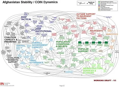
PowerPoint slides can do many things – enlighten, entertain, enrage – and recently one slide proved it could fly. The slide (shown here) endeavors to explain the American military strategy in Afghanistan, but it’s such a tangled mess of looping lines, text and boxes that it may earn the dubious distinction of Worst Slide Ever.

The slide was featured in a New York Times article, “We Have Met the Enemy And He Is PowerPoint.” So many people sent me links to this article that I felt compelled to respond here, especially because I strongly believe that PowerPoint is not the enemy.

Sure, bad presentations – whether created by PowerPoint, Keynote or other slideware – are guilty on multiple counts: they waste time, oversimplify subject matter, eliminate nuances, and generally degrade the way we communicate. But that doesn’t mean the application itself is inherently evil. Just as child psychologists say, “he’s not a bad boy, he just does bad things,” I would caution against demonizing the software because it can produce bad presentations.
In my book, Why Bad Presentations Happen to Good Causes, I present guidelines for using PowerPoint effectively. Inspired by all the fuss last week, I’ve updated those guidelines and offer abbreviated versions below.
Now, I’m not endorsing PowerPoint nor recommending you use it when you present, but whatever presentation application you choose, I’m confident these guidelines will help you create slides that support you as a presenter and deliver information in ways that are most engaging for your audience.
1. Accept what PowerPoint is not.
A PowerPoint presentation is not a document. Paper (i.e., handouts) can still do the heavy lifting of information transfer between you and your audience. Your time at the podium is an opportunity to convey the essence of your proposal, shine a spotlight on key points of a report, or tell stories that bring your issue to life. And the central purpose of your PowerPoint is to provide visual elements that more clearly explain, more dramatically depict, and more emotionally emphasize each point you wish to make. Bearing that in mind…
2. Show the pictures. Say the words.
Your audience members have two channels for processing information: visual and auditory. They look and listen and seamlessly integrate both streams of information. So play to this capability: display images with strong emotional content to engage their right brain, and use your live commentary to engage their left brain. (And for further proof that showing the pictures and saying the words is the right way to go, read Richard Mayer’s “Multimedia Learning.”)
3. Design outside the (white) box.

Al Gore Presenting “An Inconvenient Truth”
Most presentations I see use PowerPoint’s default white background for each slide. This projects the familiar white box on the screen, causing so many presentations to look essentially the same.
When you design slides with a black background, however, the LCD projector puts nothing on the screen except the images
and text you choose. This allows you to create slides with no apparent borders while focusing the viewer’s attention precisely where you want it.
The best example of this technique: the slides used by Al Gore in “An Inconvenient Truth.”
4. Use animation to control the flow of information and convey meaning.
PowerPoint offers more than fifty ways to animate text and objects. To the novice, this can seem like an embarrassment of riches, but presentations that incorporate a rich variety of animation techniques are usually just embarrassing. Used thoughtfully, however, animated words and images can help you dole out information to audience members in digestible pieces, keep their attention focused where it belongs, and even add another layer of meaning to each slide.
 5. Unify elements to create a visual hierarchy.
Like a well-designed print ad or billboard, a PowerPoint slide should capture attention like a stop sign and direct it like a road map. Too often, however, the slides in nonprofit presentations are all over the road. They may appear at a glance to have the minimum daily adult requirements – a title, bullet points, picture and caption – but the overall design does not tell the viewer where to look first, second, third, etc. There is too much visual clutter. And as a result, the eye wanders, then the mind wanders, then the viewer wanders right out of the room.
6. Discover the little miracles.
PowerPoint can perform some very useful tasks at the touch of just one or two keys, but for some reason, most presenters are unaware of these capabilities. Two in particular worth using are:
The Miracle of the B Key
Given the choice of looking at the speaker or a slide, audiences generally choose the slide. Don’t take it personally: if they can hear you, they will not feel obligated to look at you, too. Sometimes, though, you need their undivided attention. When you press the B key, the screen will go black, and every eye in the room will return to you. Press it again and your slide magically reappears – and every head will turn back to the screen.
Display Any Slide, Any Time
To jump to any slide at any time, simply type the number of the slide you wish to display (using the number row on the keyboard) and hit the “enter” or “return” key. Of course, this requires having a numbered list of all your slides handy, but for that small amount of extra preparation, you can move with complete freedom from one end of your slide deck to the other.
To learn more about creating compelling presentations, register for The Goodman’s workshop “The Platinum Rules of Presenting”on December 9 & 11.