In Case You Missed It: This article is from our December 2017 edition of our newsletter “Free-Range Thinking.” The lessons learned about how to avoid bad ads still ring true. Stay tuned to the end for a 2023 update.
Within the past few weeks, America’s largest tobacco companies have started running television and print advertisements explicitly detailing the dangers of smoking. The ads were produced in response to a federal court order, but it took eleven years of wrangling before all sides could agree on the exact wording of these “corrective statements.” The full-page print ads and TV commercials that were finally delivered may meet the specifications of the court order, but they are terrible advertising by any standard.
As Yankee legend Yogi Berra once said, “It’s déjà vu all over again.” In the late 1990s, Philip Morris produced a “Youth Smoking Prevention” campaign that included a series of print ads targeting parents of teenagers. The ads are a master class in what not to do if you want to engage readers and change behavior. So this month we’ve invited an advertising expert to revisit those ads and red-pencil all the wrong choices that went into them. It’s our hope that identifying these errors – some obvious, some less so – can help you avoid similar missteps as you design marketing materials of your own.

Libby Morse
Libby Morse is Senior VP and Creative Director for Lipman Hearne, a branding and communications strategy firm that works with nonprofits, foundations, colleges and universities. For more than two decades, Morse has overseen brand development and hundreds of campaigns at Lipman Hearne, and prior to that she helped develop TV, radio and print campaigns at DDB Needham Worldwide.
Before evaluating the Philip Morris ads, Morse insisted on one caveat: the ads are more than 20 years old – social media and smart phones have revolutionized how audiences look at print advertising. “We used to think that we could instruct people step-by-step how to read an ad,” Morse said. “Look at the picture and headline, then read the words set in white block below it, then have the ‘a-ha moment’ in the tagline. You don’t see much of that anymore. Our eyes are trained to scroll, so full-bleed, bold visuals with a simple headline and minimal, if any, copy is the only way to attract eyeballs.” That said, Morse identified the following problems which ad designers must still avoid today:
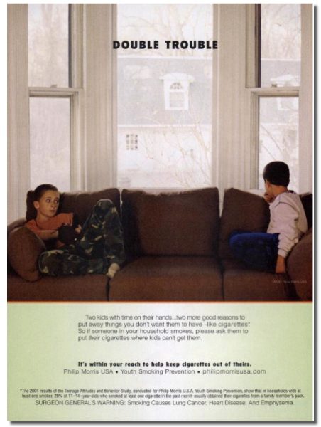
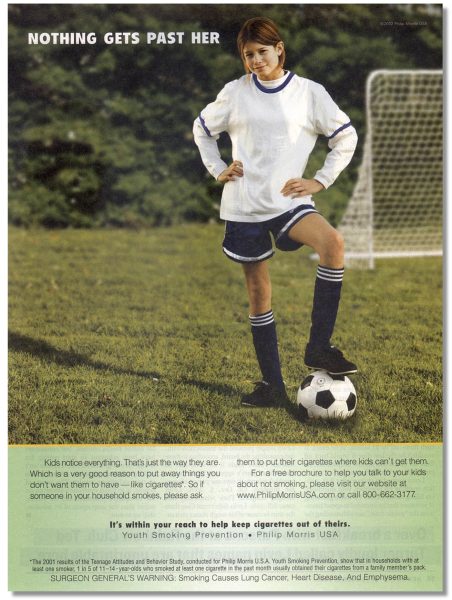
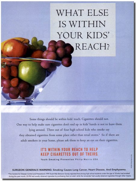 Failing the “at-a-glance” test: Readers page through newspapers and magazines fairly quickly, so an ad only has a second or two to grab your attention. Consequently, it has to give you some idea of what it’s about in just a glance. All four of these ads fail that test miserably – there is absolutely nothing in any of the imagery or headlines that signals these are about smoking.
“The conventional wisdom in advertising used to be ‘never see and say.’ It wasn’t considered creative,” Morse said. “But audiences today want directness, transparency, and authenticity. Why isn’t there a pack of cigarettes on that counter instead of a bowl of fruit?” Whether you’re designing print ads, brochures or even web pages, Morse added this advice: “Think about the advertising that catches your eye when you walk through an airport. They know you’re not going to stop and read because you have to get to your gate. So these days, you’re not making print ads anymore. You’re making posters.”
 Ambiguous or confusing headlines: If a headline should make you want to read more, all of these ads fail at that level, too. The headline, “What else is within your kids’ reach?” could have worked, Morse said, “but only if the ad had showed something that immediately conjures up danger.” As it stands, who could fault a parent for reading the headline and thinking, “So my kid can reach fruit – that’s a problem?”
Morse was similarly nonplussed by the ad with the headline “Double Trouble.””Does this mean the two kids are demon seeds?” she wondered. “That’s what I see. I think they want to convey that they are bored, but it’s the image itself that’s boring. Think of how much more effective it would have been if we had been eye-to-eye with those kids, instead of clear across the room from them.”
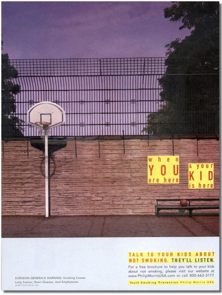 Trapped space: This design flaw is present in all four ads, but it’s most problematic in the one featuring the image of a basketball court. The pole supporting the backboard and hoop creates one visual boundary on the left side of the ad, and the two yellow blocks of text create another boundary on the right. The area in between is trapped space: empty and devoid of visual interest. And while this might seem counterintuitive, it’s probably the first thing you looked at. “Your eye goes straight to where there is nothing,” Morse said, and the next step is often to turn the page – the rest of the ad goes unread.
Terrible tagline: Morse, who is a voracious reader and appreciates a well-turned phrase, was particularly annoyed by the campaign’s tagline, It’s within your reach to keep cigarettes out of theirs. “It feels utterly manufactured – you can almost hear the ad team coming up with it. Successful taglines today feel intuitive, conversational – they capture the voice inside the audience’s head.”
 Other problems: “It’s shaming, which is another way of saying it’s a one-way conversation. That kind of command-and-control marketing doesn’t work anymore. And it’s not straightforward. It has a weird circularity to it. It’s within your reach to keep cigarettes out of their reach so they won’t reach for them, etc., etc. And doesn’t ending a sentence with the words ‘theirs’ look like it’s a mistake? By the time you get there, your brain thinks, ‘What’s theirs?'”
Buried ask: Ultimately, these ads are asking adults to avoid leaving cigarettes around where teenagers can find them. The ask is not in any of the headlines, and if you read the tagline closely, it is only informing adults that they have the power to make cigarettes less available, but there is no explicit call to action. For that, you have to go deeper into the body copy to find the words, “put…cigarettes where kids can’t get them.”
“Don’t leave your call to action to the tagline,” says Morse. “Make it clear in the headline. And don’t make it an order. Make sure your audiences feels that you know what they’re up against. Be shoulder to shoulder with them. Tell them, ‘Let’s do this together, because we’re in this together.'”
Update: Philip Morris’s current ‘anti-smoking’ work is a program called “Unsmoke the World.” This program was launched in 2019 along side an announcement that they were committed to being smoke free. Below are a couple of images currently on www.unsmokeyourworld.com. You can judge for yourself if Morse’s assessment of their ads from 2017 rings true for Philip Morris in 2023.